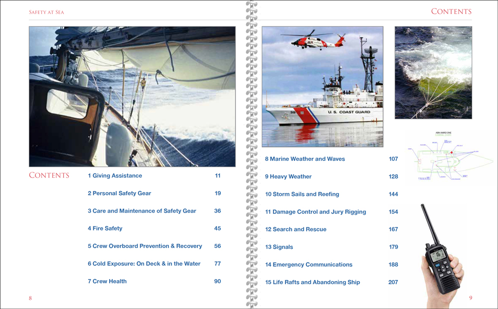
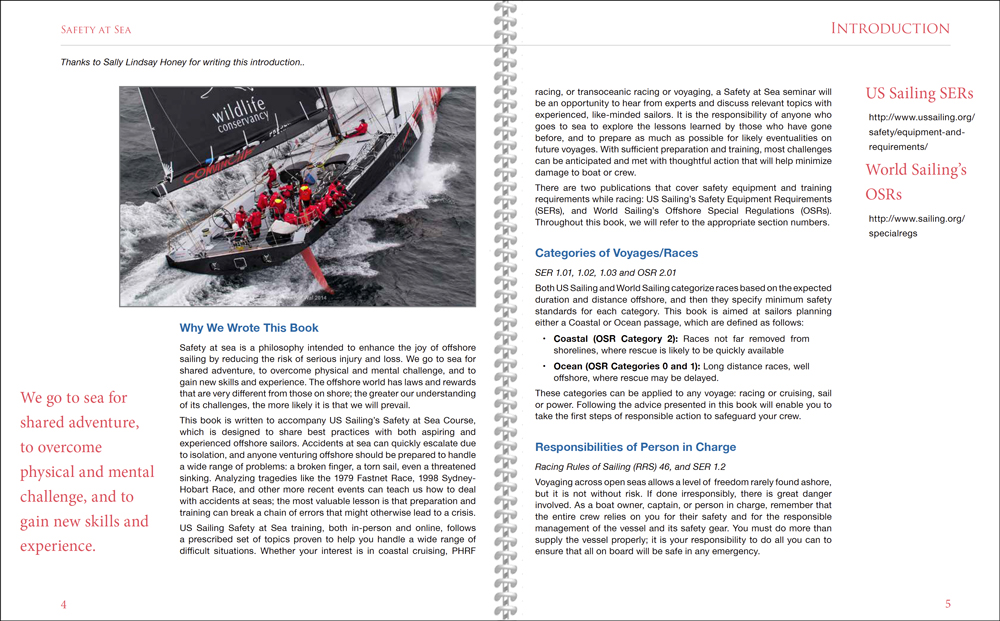
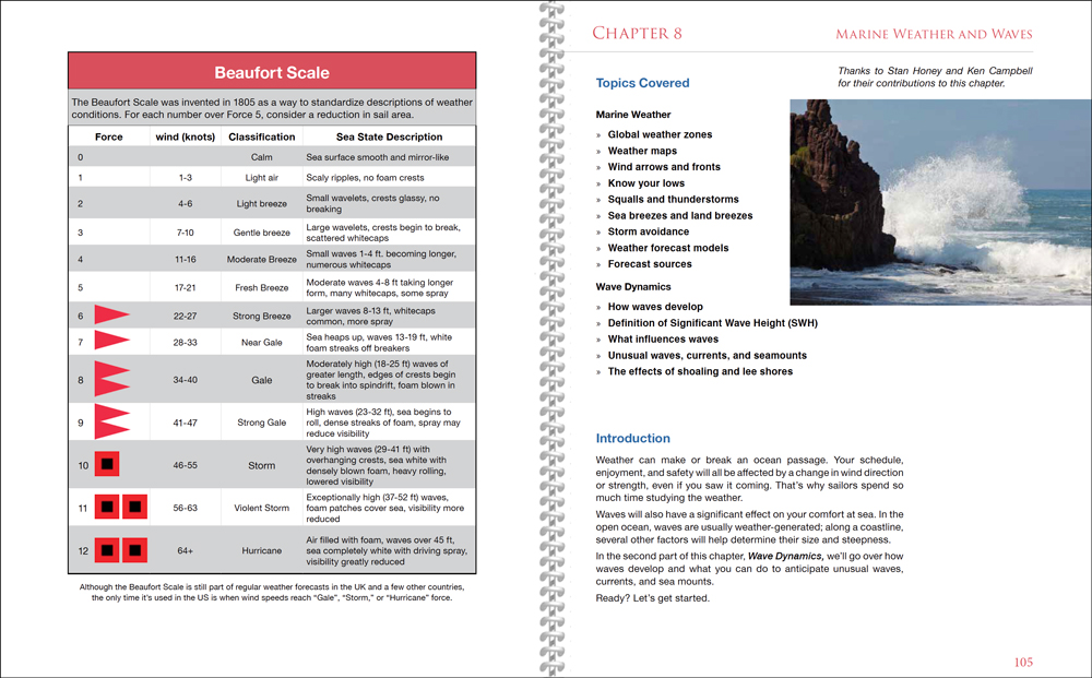
In today’s world of content shock and stimulus overload, readers will move on to another story if text isn’t clear, accurate, and well formatted. The copy of Safety at Sea: A Guide to Safety Under Sail and Personal Safety that just landed on my desk is a great example of how layout can help us absorb what’s on the page.
(This is the project that was Saved by the Deadline.)
While the original brief was to create an instruction manual for USSailing’s Safety at Sea course, the combination of excellent information with a nice layout and useful graphics turns these 220 pages into a valuable stand-alone book for anyone interested in safety offshore. By coordinating so much knowledge into one cohesive unit, we created a book that is masquerading as an instruction manual.
Content Coordination
Chuck Hawley, the project’s chieftain, has been compiling content for a publication like this since 2012. By the fall of 2016, he and Sally Lindsay Honey had already collected a TON of information from an impressive list of experts and divided the topics into fifteen chapters. My job was to coordinate it all into one cohesive unit, without losing any of the useful details that dug so deep into various topics.
As black text on a white page, most of it was a pretty dry read—though maybe that’s not the right adjective for a book dedicated to the very wet world of offshore safety. Then we started adding graphics and testing out various page templates, and the content came to life. Words can tell a story on their own, but combining text with helpful graphics and photos made it easier to “see” the key points we were trying to make.
Working with Chuck and Sally was a treat. They knew the material very well, but they also knew who to ask for a clarifying detail when needed. I brought just enough experience of life offshore to understand the topics—though best practices have evolved quite a bit since the 1980s, when a Transatlantic and several other offshore passages made these topics a more personal priority. And that perspective helped me to maintain the editor’s middle distance.
Custom Graphics
The other key person involved was Brad Schoch, USSailing’s Instructional Designer. When we discovered we were missing a couple of key diagrams, Brad quickly created them, filling what would otherwise have been obvious holes with graphics that matched the rest of the chapter.
While book and online learning can never replace the actual experience of righting a capsized liferaft or putting out a galley fire, thinking through various situations—and reading about how others dealt safely with different types of emergencies—is still extremely valuable when preparing to head offshore. I like to think that helping to make this book look so good will help both experienced and aspiring offshore sailors to absorb the excellent information crammed between its covers.
Whether or not you plan to take the Safety at Sea course, you can buy the book at the USSailing Store. And if you have any feedback, send it to safetyatsea@ussailing.org.


Nice job, Carol. Making the complicated look handsome, appealing m, and (relatively!) simple is a fine art, and the new safety book’s a good example. — John
Thanks John. Coming from you that is a very nice compliment!