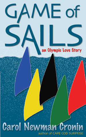
One of the many distinctions between ebooks and paper books is what you see first when you pick up the book again to start reading. With a paperback or hardcover, you see the cover, every time. With an ebook, you’re automatically sent to the page on which you ended your last reading session. Pushed back into the story, rather than having to page your way from cover to bookmark.
That may reduce the familiarity caused by repeated sightings, but it doesn’t make the ebook cover less important. Ebooks need distinctive covers just as badly as their paper cousins.
Scroll down through any list of ebooks and a few covers catch your eye, standing out from the crowd—just like browsing the shelves in a brick and mortar store. Cover design tells the reader intuitively what to expect from a book, which is why traditional publishers have entire departments devoted to cover creation. Much more than the word choice on page 126, it’s crucial for sales to get it right.
I didn’t get it right the first time with Game of Sails. The original cover was designed mostly out of laziness; I didn’t have a photo that would be generic enough, so I started from a blank light blue background. The result, in the words of Paula Margulies, looked “like child’s artwork.” She (and all but one of the others who gave me feedback) didn’t see the five sails as intended: representations of the five Olympic rings. Instead, all Paula saw was something that would tell people they were opening another young adult book.
“You’ve got to sell the romance,” she said. “You need two people on the cover, not colored sails.”
So after heaving several large sighs about how long it would take, I began a search through iStockPhoto. I wasn’t sure I’d ever find something that would work. After all, I was looking for a photo of two people I knew well—but who didn’t exist anywhere beyond the page. And they had to look like they were attracted to each other but fighting it—and it had to be outside. But not outside in a field, or a yard, or a parking lot. Outside on the water…
What were the odds of finding something so specific?
As it turned out, it was just a question of finding the right keywords for my search. After “man+woman+yearning” led me to chains and more than few whips, I changed “yearning” to “relationship.” Closer, but still lots of bedrooms and smoky restaurants. So I tried adding “watersports” and came up with “Your search returned no results.” Bleh.
Then I tried “relationship+outside,” and somewhere on page 6 I hit the jackpot. No, Casey doesn’t have a thick braid and yes, she’s a bit too short. But the atmosphere created by the photo was just right. I hit download.
All that remained was one of my favorite design challenges: overlaying text so it would be legible, highlight the photo, and balance the page. Finally I added the medal to make it clear what was at stake.
Of course updating the cover isn’t something you can do with a paper book. But with ebooks, I simply uploaded the file and —bingo! Within 24 hours the personality change was made.
What do you think? Does the new cover do a better job of conveying “Olympic love story” than the old one? Let me know in the comments below, and I’ll send a random commenter a coupon for a free download.
