I’m more of a reader than a watcher. Given the choice between a how-to post and a how-to video, I’ll almost always choose to absorb the information with my eyes.
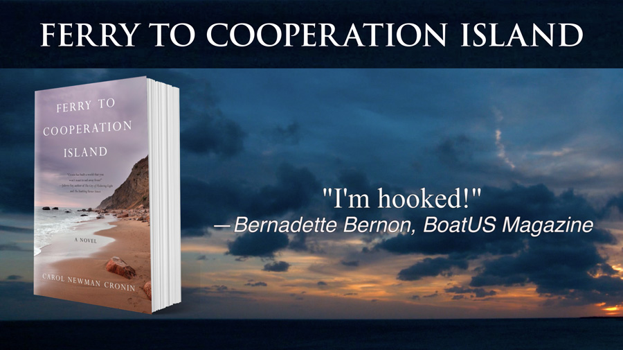
But even readers like me enjoy watching stories unfold on a screen. Which explains why book trailers (and BookTube) are such a “thing.” Nothing captures a mood and a place like video. And that’s why we made a book trailer for Ferry to Cooperation Island, which just went live today!

Creative, not linear
I’m really proud of where we ended up, but like most creative endeavors it wasn’t exactly a linear progression from start to finish. Luckily, I had a lot of help. First and foremost is Paul Cronin Studios; their global headquarters share an address with my own firm, so creative collaboration is quite easy and fun. Paul has amassed an incredible video library over the past few decades, including several clips that look a lot like the imaginary Brenton Island.
We also had help with text animations from my nephew Sam Newman, who’s just graduated from Elon University with a degree in Cinema and Television Arts. (Anyone looking for a smart and friendly video assistant?)
So all I had to do was figure out what I wanted; how to capture the essence of a 376 page story in a 60 second video? That, of course, turned out to be the hardest part of all.
First, I watched several book trailers and found a few I really liked. Next, I created a storyboard of text that would accomplish the same job as the back cover copy—but in far fewer words, so each could be read in only a few seconds of screen time. Once we had an idea of what we were trying to express, Paul dug into his archives and put together a visual timeline. After adding background music (a time sink in itself, trying to find something that sets the right tone without being too distracting), the files went to Sam. Sam returned animated text examples, which quickly showed what “worked” and what was too distracting.
That’s when things got complicated.
After watching the video several times, I realized the words on-screen (even after another round of edits to increase clarity and brevity) just weren’t doing their job. Worst of all, trying to read distracted from the far more interesting video clips. How to get the story across, while still letting the magic of moving pictures shine through?
Fortunately, before I’d scratched my head for too long, I checked in with fellow author Alice Early. When I mentioned the almost-completed trailer, she said, “and of course you’ve included some of those great blurbs you got.”
We hadn’t! Damn.
Lightbulb moment
My favorite creative moments are when a key idea is sparked by a seemingly obvious and somewhat random thought—my own, or someone else’s. Alice suggested adding a few simple quotes on at the end, to close with someone else telling the viewer what a great book it was. But that thought led to this one: what if we replaced ALL the text with blurbs? That would be WAY more powerful.
Paul was a little skeptical at first, but he agreed to try another version. An hour later, I got a great text: “Come check it out, I like it.”
I like it too! Let me know what you think—especially if it inspires you to pre-order the book.
PS: Thanks for reading (and watching), and don’t forget to join the launch party conversation on June 18. Can’t wait to share my best story yet!
can’t wait to receive it in my pre ordered amazon to my kindle! sounds wonderful!
Thanks Sherry! You *should* get your kindle copy on June 16. Enjoy!
Congratulations Carol, I am just waiting for your book to arrive so that I can read it.
Thanks Monica! Please let me know when it arrives… there seems to be a lot of variety in timing, probably due to shipping issues.